


Cooper Black: The D.B. Cooper of Typefaces
A love letter to one of the most endearing typefaces of our times.


Lead type image courtesy of the wonderful Tyler English of Ulterior Press.
Perhaps it’s fitting that Cooper Black and D.B. Cooper have a word in common, even though the former is a typeface and the latter a media epithet given to an unidentified man who hijacked Northwest Orient Airlines Flight in 1971 (Or as the Marvel Universe would have you believe, it was actually Loki the god of mischief up to his antics again). Why is it fitting you ask? Well, both have gained a certain notoriety and there is one big question surrounding each:
Why is Cooper Black everywhere?
Who really is D.B. Cooper?
Is D.B. Cooper actually a typeface and not a real person? (Nobody is actually asking this).
I’m going to try and answer one of these questions today (If this post gets 1 like, I’ll answer all three, especially the last question).
Index
Back to Basics
A Little Bit of History
Typeface Analysis
Why It’s Everywhere
Final Thoughts
Back to Basics
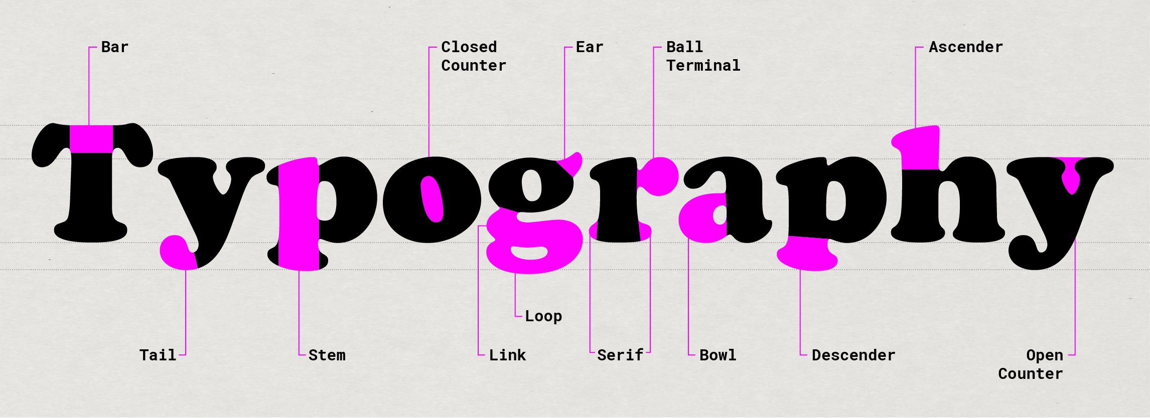
But first let’s ask ourselves, what exactly is a font? What is a typeface? And what in the hell is a serif, bowl, ascender, descender, and all the other terms hipster-looking dudes with black glasses (like me!) throw around?
If you thought the words Typeface and Font are interchangeable, you’re not alone. A typeface is the underlying visual design that can exist in many different typesetting technologies, whereas a font is one of those implementations. In other words, a typeface is what you see and a font is what you use. For example, Helvetica is a typeface. Helvetica Bold or Light or Medium are fonts within the Helvetica family.
As for all the other terms, take a look at the handy cheat sheet below:
A Little Bit of History
Before the advent of modern printers, scribes copied books by hand on scrolls and paper, or print-makers printed texts from hand-carved wooden blocks. Both processes took a long time and books weren’t readily available. In the 15th century, Johannes Gutenberg of Mainz, Germany, invented a metal movable type printing system: the first printing press. As technology improved, by the late 19th century Linotype machines (huge Rube-Goldberg-like contraptions) had become the standard method of setting and compositing type.
This was the area in which our hero, Oswald Cooper operated. A type designer and lettering artist based in Chicago, in 1918 he first released a fully-formed typeface he was working on dubbed ‘Cooper Old Style’. By taking a classic Roman typeform and softening its edges, Oswald was able to create a distinctive and unique typeface.
It was a big success and seeing promise in his design work, he was commissioned by the Barnhart Brothers & Spindler type foundry to make a bold display version of Cooper Old Style. Circa 1920, Oswald Cooper released Cooper Black. It was an immediate hit.
Typeface Analysis
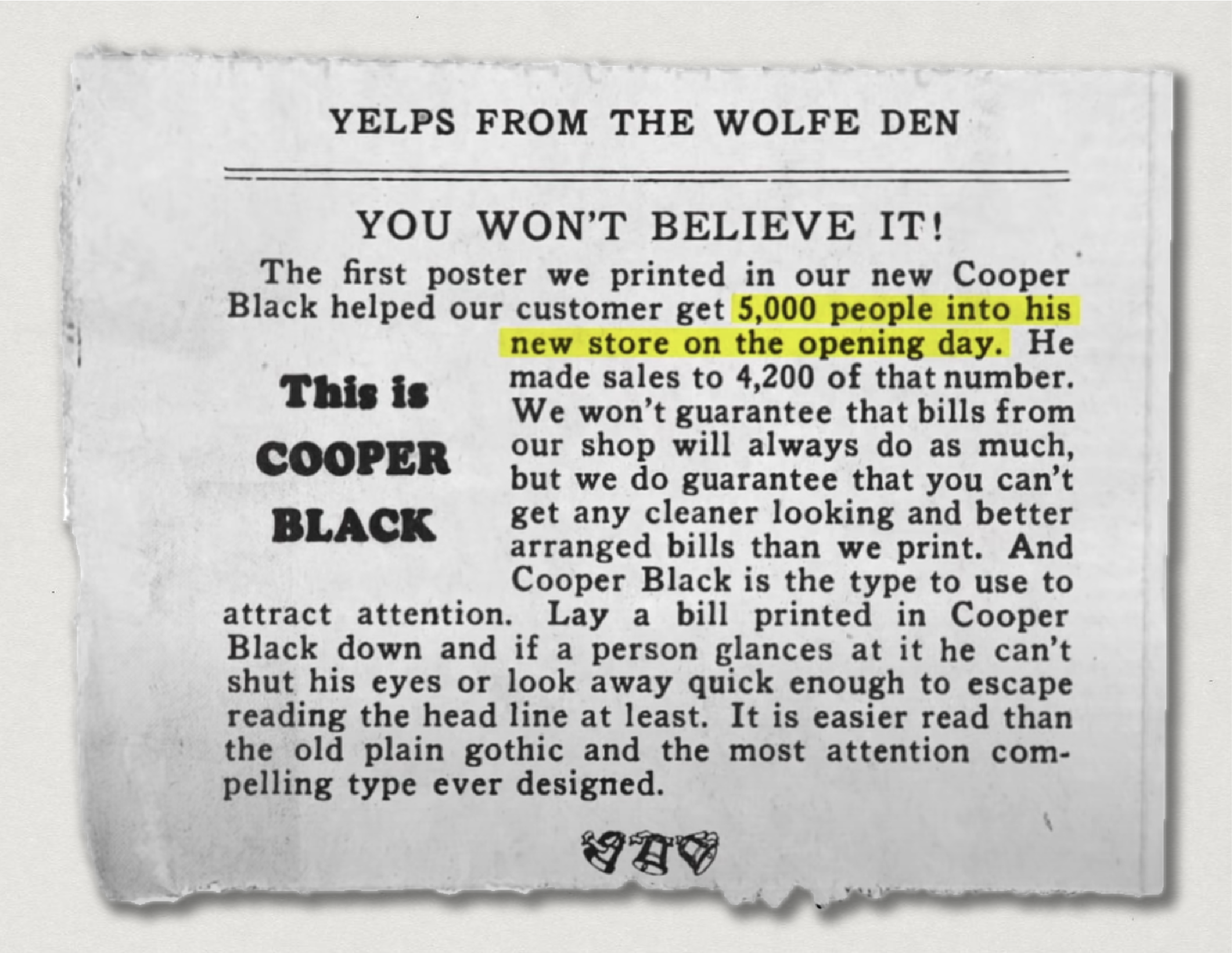
Oswald famously referred to Cooper Black as a typeface “for far-sighted printers with near-sighted customers”, and he was right! It was used for newspaper headlines and large-scale posters. It sold cars, cold medicines, music lessons, turntables, and ginger ale. In fact, this ad for the typeface below credits Cooper Black for getting 5000 customers into their clients’ new store on their opening day:
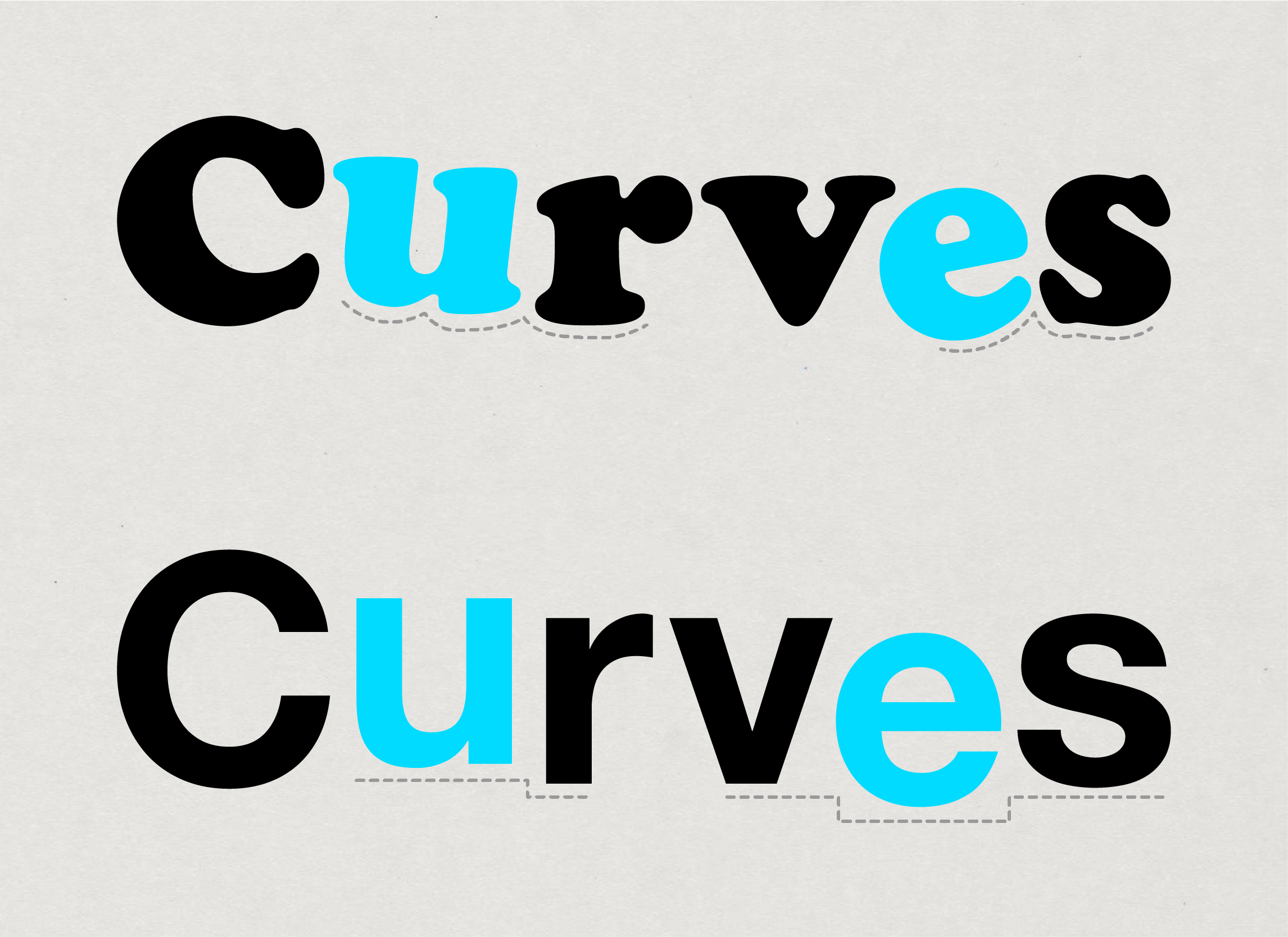
So what gives? Well for one, it commanded your attention. Compare it to any of the other display fonts out in the market and Cooper Black stuck out like a sore thumb. It is loud and proud, without compromising the legibility of the individual letters. And how does it do that you ask? The curves.
Take a look at the bottom parts of any of Cooper Black’s letters. You won’t find a single flat edge. A very strange, iconoclastic design choice indeed since all typefaces at that time had flat bottoms. This was the convention since a flat baseline helped stabilize a line of text, making it easier for the eye to navigate large sections of copy. Even Cooper Black’s contemporaries like Goudy Heavyface and Pabst Extra Bold fail to break this convention. It is these curved baseline serifs that make Cooper Black very forgiving to the printing irregularities of the day. The curves also make it so that the serifs of one character naturally flow into another even when the characters are slightly uneven. Those irregularities look like big mistakes in any other typeface with flat bottoms.
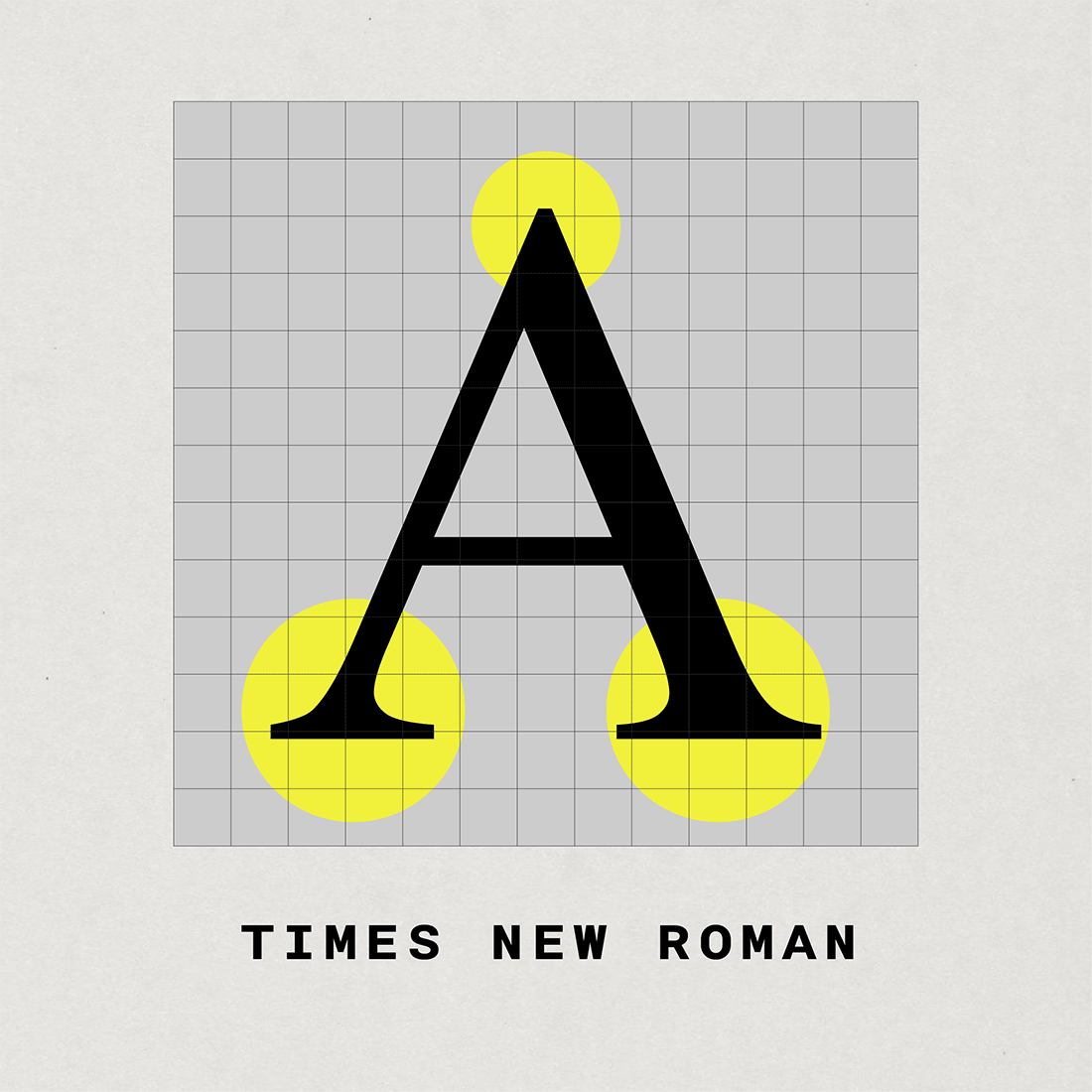
Another defining aspect is how Oswald Cooper was able to really use negative space to make the typeface look big and bold, yet friendly and approachable. For instance, take a look at the lowercase ‘f’. To me, it truly showcases Cooper’s skills as a calligrapher. Cooper was able to pack an extremely bold character with lots of intricate details while still maintaining a slim profile. Keeping that detail, without losing legibility or flexibility is an incredible feat. A quick peek at the lowercase ‘g’ shows something quite remarkable too. It is a double-story form (A type of letter that has two counters, as opposed to the single-story version, which has only one counter), this allowed Cooper to include more negative space in the character, contributing to its light and friendly demeanour. Let’s check out the upper and lowercase ‘O’ next. Most typefaces have a vertical stress on the counter in the way the ‘Os’ are drawn however, Cooper’s tilts back 15°. It may look off-kilter on its own, but when paired with a word or phrase, it always seems to complement the other letters. Finally, notice the tittles (the dots on top of the lowercase ‘i’ and ‘j’) they are squished, and ovular instead of being perfectly circular. Another little quirk of this typeface which contributes to its overall charm.
Why It’s Everywhere
Broadly speaking, Cooper Black’s versatility in keeping up with rapidly changing design technology is the reason for its ubiquity. In the 1950s, two new ways of printing emerged which thrust Cooper Black into the limelight once again:
Phototype, a method of type setting which used darkroom photography to make rows of type on photographic paper made it much more easier for designers to get creative with how they set type.
And dry rub transfers also called rubdowns (made famous by the Letraset corporation); decals that could be applied to virtually any surface without the need for ink or any kind of solvent.
Designers and non-designers alike now had the tools to do something they never were able to do before in the days of hot metal type: squish letterforms closer together and overlap letterforms on top of one other. Cooper Black quickly became a part of the counter-culture movement, its friendly forms became a staple of the tongue-in-cheek aesthetic of the 1960s and 70s, it showed up in experimental magazines, blockbuster movie posters, and what seemed like trillions of album covers. Cooper Black’s adaptability to work in metal type, phototype, rub-on lettering, and also now digitally is why it is everywhere.
In the Wild:
For more examples, check out Fonts In Use.
Final Thoughts
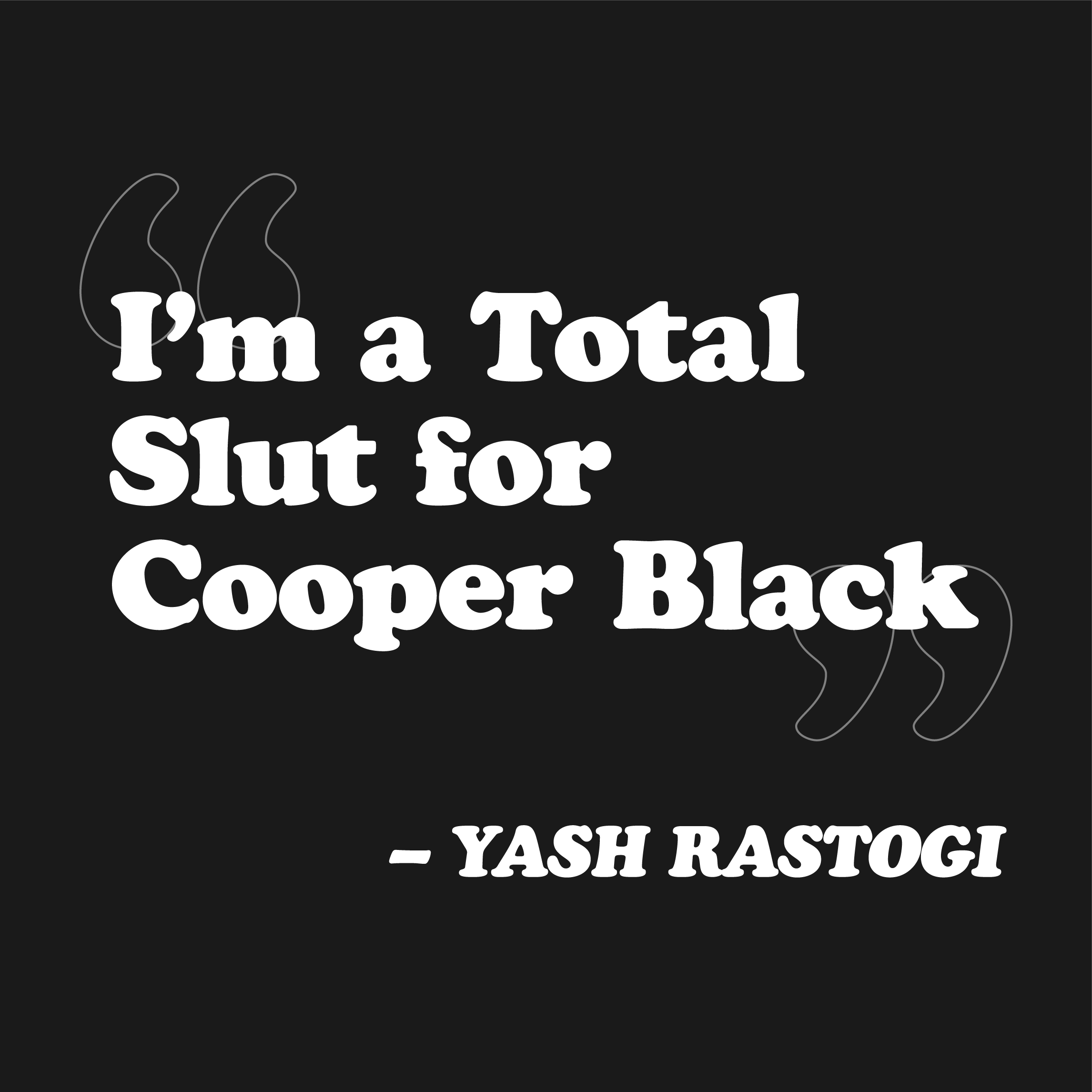
By now you must have an idea of how much I truly love this typeface. In fact, I actually use it on my resume and have been quoted as saying that:
I think I finally realized why when I moved back to Mumbai after my undergraduate studies. There’s a small street not too far away from my house. You’ll find shops, medical stores, large luxury buildings, food carts, and restaurants over there. Nothing remarkable, streets like this are in the fabric of the city. However, on this small 300m stretch of road, Cooper Black appears 7 times on those shops, medical stores, buildings, food carts, and restaurants (seriously, I counted). For a typeface designed in 1920s Chicago to appear a hundred years later on such a diverse street in so many different applications is truly what Cooper Black is all about. The next time you’re taking a walk in your area, try and look for Cooper Black. Chances are, you’ll see it more often than you thought you would.
Thank you for spending the time to read through this edition. We hope you enjoyed consuming our content, as much as we enjoyed creating it. Stay tuned for more!
You have successfully experienced our Experimental Lab! 🧪
Happy to learn the history and details about COOPER BLACK. Your love for this truly shines our. Am waiting to read more information as you promised. Also will reread this article to get more information.
Keep this up.